UX DESIGN / WEB DEVELOPMENT
As a web developer and UX designer, I use a strict design and development process, as well as frequent collaboration with clients, to ensure that the final product reflects the branding/ethos of the client and fulfills the client’s digital communication needs.
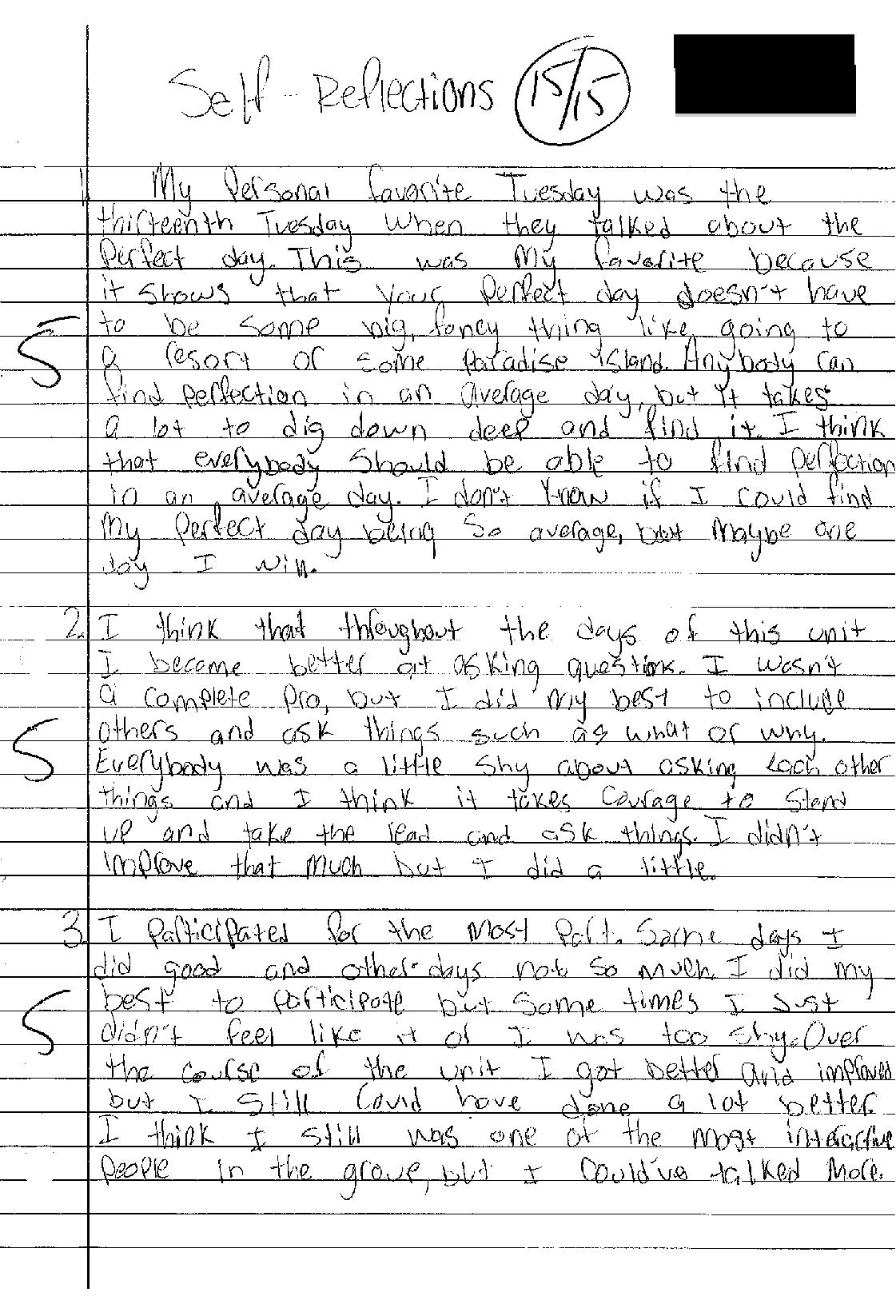
Humans Uniting for an Equal Society (HUES) Website
HUES Website
Overview
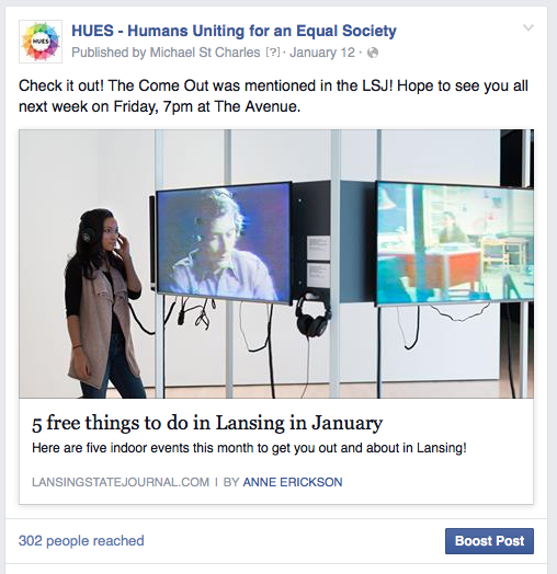
As a freelance web developer, I am currently working with Humans Uniting for an Equal Society, a small nonprofit in Lansing, MI, to create their organization's website. This website's purpose is to lend the organization further credibility with the community and to inform users about facets of the organization, such as who the board members are and what happened at current/past events and meetings. The project is currently in the coding and development segment of the process.
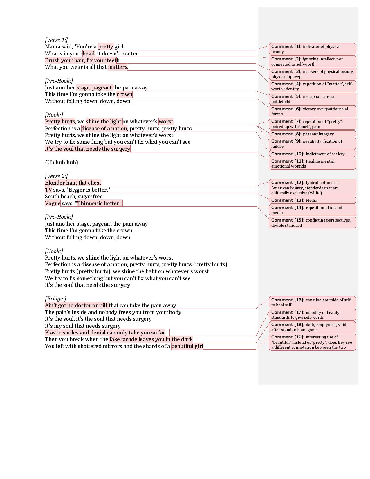
Strategy & Scope Research / Architecture Diagram
Before engaging with the research necessary to begin this project, I met briefly with the HUES Board to discuss the how the website needs to be aimed at creating a well-rounded image of HUES, communicating the mission of HUES, developing credibility within the community, and recruiting new members. I also created a project plan to keep me on a designated track throughout the design and development process.
In order to determine how best to implement this strategy, I collaborated with the Board to determine the scope of the information that the organization needs to communicate through the website, and how the website can be divided into pages to accomplish these needs. I also researched the websites of local nonprofits, analyzing how they organize their information, what kind of information they contain, and how to improve on their construction. After determining the struture of the website, I used Slickplan to construct a architecture diagram for the HUES website. The architecture diagram can be found below.
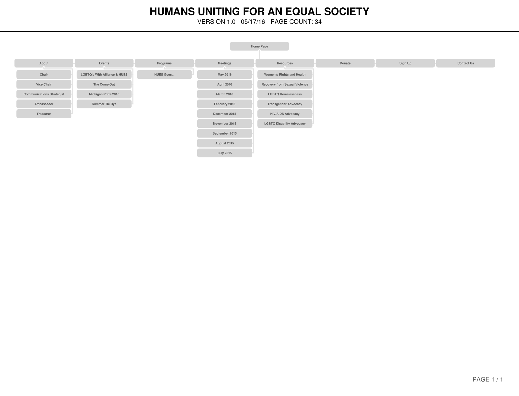
CLICK TO DOWNLOAD ARCHITECTURE DIAGRAM
Content List
Before designing the website, I worked closely with the Board to create a list of the content needed for each of the website’s pages, as well as the size or length of each of the content elements. During this process, in addition to the creation of content, typography was chosen for the text, as well as color and textures for the backgrounds and containers. This was done to expedite as much as possible the process of creating the design prototypes so that the final images and text could be quickly acquired and used for the prototypes. The content list for the "Home" page can be found below.
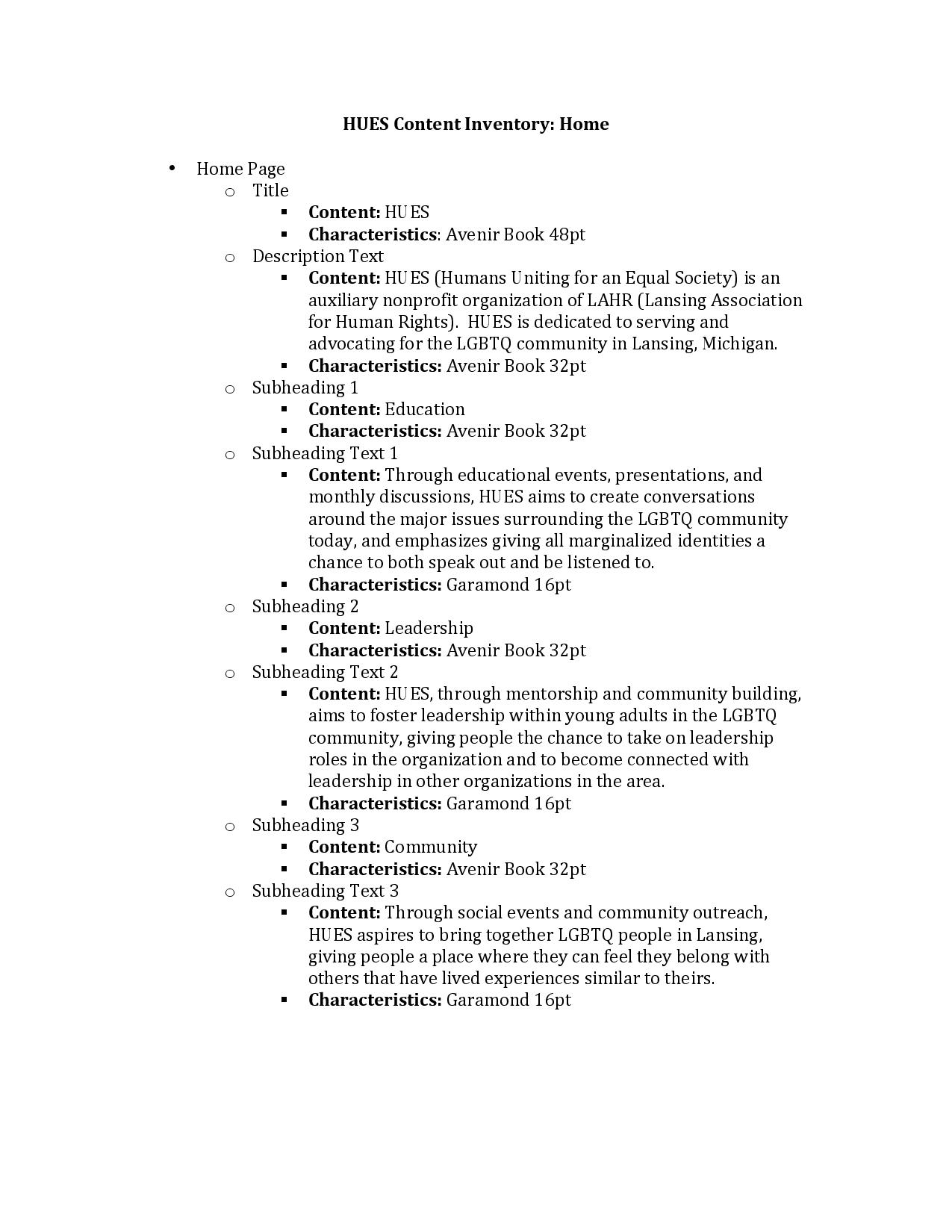
CLICK TO DOWNLOAD CONTENT LIST
Lo-Fi Sketches
After undersanding the structure of the website itself, I shifted towards designing the skeleton of the various pages. As a result, I drew out the initial sketches so I could show the Board a quick sketch of what these web pages would look like and how they could display navigational elements, images, and text content in a structured, organized layout. I also created these in order to determine what the navigational structure, information structure, and interaction structure of the page would roughly look like. Examples of lo-fi sketches for this website can be found below.
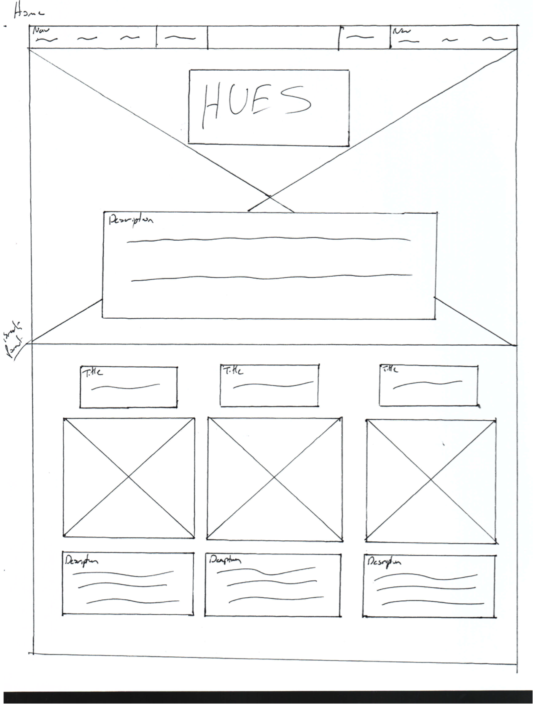
CLICK TO DOWNLOAD LO-FI SKETCHES
Lo-Fi Wireframes (Axure)
I used Axure RP to produce digitized wireframes of the website’s pages. The purpose of these wireframes was to illustrate for the Board the layout of the website, showing the exact dimensions of the website’s content containers, images, and text containers. These were also created for the purpose of illustrating how navigation operates between pages, as well as the function of some of the website's interactive elements. Examples of the lo-fi wireframes for the landing page and "About Us" page can be found below.
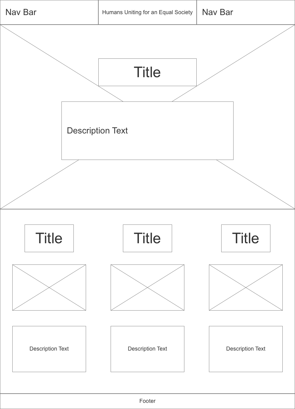
CLICK TO DOWNLOAD LO-FI WIREFRAMES
Hi-Fi Design Prototypes
The purpose of these design prototypes was to implement the content, typography, and color/textures into the website, providing visual prototypes that aimed to mimic the final visual layout of the website. These were then submitted to the Board for approval. During this submission process, I engaged the Board in dialogue in order to gather feedback that would then be realized in the coding and development process. After approving the prototypes with the Board, I conducted simple user tests, analyzing how users perform some of the key experiences on the website and whether the design needs to be revisited in order to improve those key experiences. Examples of the design prototypes for the landing page and "About Us" page can be found below.
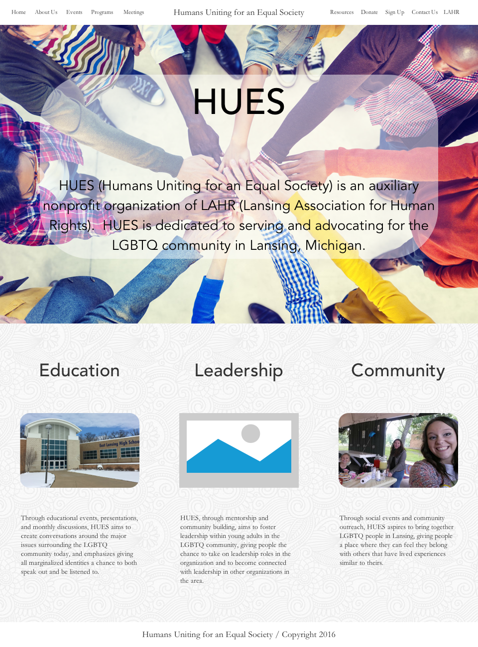
CLICK TO DOWNLOAD HI-FI DESIGN PROTOTYPES
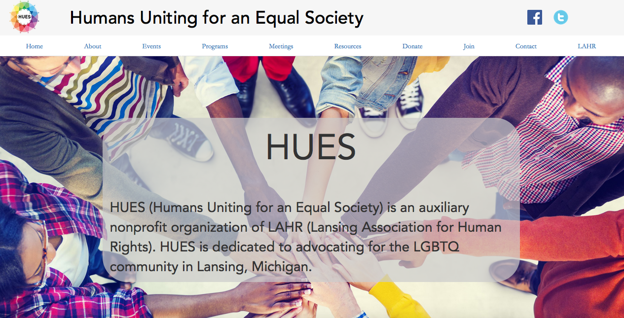
Coding and Development
This website was coded using Bootstrap as a CSS Framework in order to utilize a mobile-first approach. Screen breaks were only created for a desktop version and a mobile version. The tablet version of the website is essentially the same as the desktop version. Instead of creating sub-pages for sections just as individual board members or individual events, I used JQuery as a means to keep all of the content on one page, creating clickable trigger events to show and hide certain containers on the page. This simplified the website by eliminating excess HTML pages, speeding up navigation to those sub-sections. After the website was finished, some user testing was conducted to scan for major usability issues, after which fixes were issued to the most pressing issues.
My current post-launch role is to update the website when new content is given to me, and to suggest changes and updates that could be implemented to enhance the user experience and meet the goals of the organization.
A link to the website can be found below.
Project Armory Website
Project Armory Website
Overview
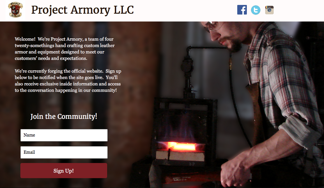
As a freelance web developer, I am currently creating the website for one of my clients, Project Armory, a new business out of Mason, Michigan. I frequently meet with Project Armory’s Team Lead to determine how to refine the design of the website and its content, as well as how the website can best fit the needs of a company based around e-commerce, information dispersal, and community creation. The project is currently in the development process.
Strategy & Scope Research / Architecture Diagram
After a couple initial meetings with the entire team, where we discussed the purpose of the website and how far the scope of the project should stretch, I conducted research on the websites of local businesses in the area, especially businesses that sell the same kind of product as Project Armory. This research also worked as a competitive analysis, showing Project Armory what local businesses they would be competing with and the features that their digital spaces offer to users. After examining the ways that these websites funnel users toward their products, I had a dialogue with Project Armory about the features that should be included on their website. After coming to a consensus, I created a architecture diagram to define the structure of the website. The architecture diagram can be found below.
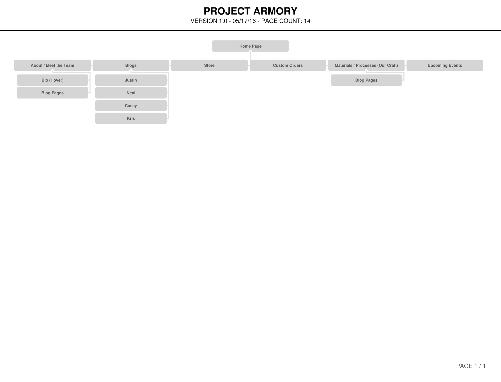
CLICK TO DOWNLOAD ARCHITECTURE DIAGRAM
Content List
Before designing the website, I provided the Team Lead with a list of content that I needed in order to create design prototypes for the entire website. We divided up the content so that the Team Lead could create the content that he specifically wanted to handle and I could create the content that I was tasked with writing. After the content was created, I worked to edit it to the point that it was finalized and cleared for use on design prototypes for the entire website.
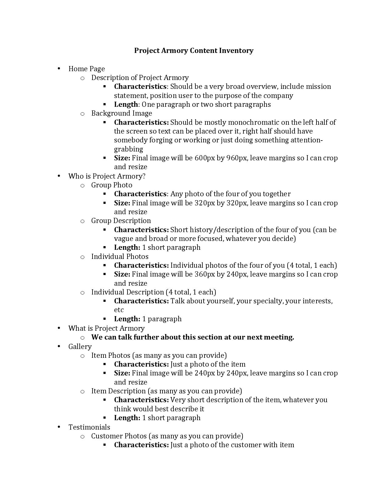
CLICK TO DOWNLOAD CONTENT LIST
Lo-Fi Sketches
After creating the structure of the website and defining what content is needed, I looked to design the skeleton of the various pages. I quickly drafted sketches of the proposed layout of the website pages in order to clear the initial design with the Team Lead, discussing the layout of navigational items, images, and text content before moving onto digital prototyping. An example of a lo-fi sketch can be found below.
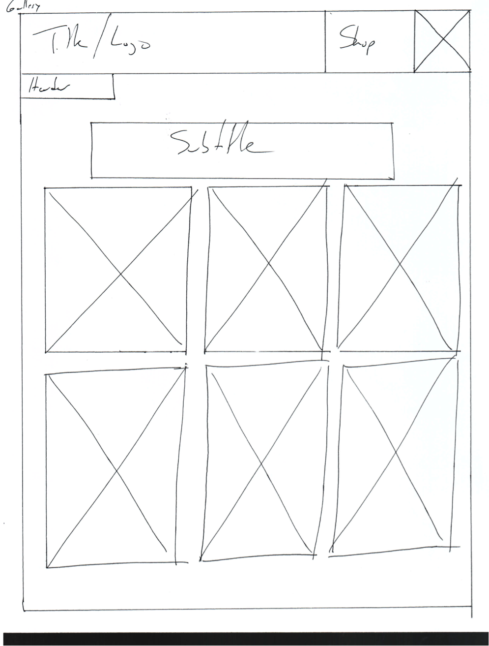
CLICK TO DOWNLOAD LO-FI Sketches
Lo-Fi Wireframes (Axure)
I used Axure RP to produce digitized wireframes of the website’s pages. These digital wireframes were designed to show the Team Lead a more defined layout for the website, providing exact dimensions for images and content containers. I also wanted to illustrate how the components of the website interacted with one another, as well as how the navigation system operated. After another meting with the Team Lead, these layouts were edited so they could be utilized in the initial phase of the design prototypes.
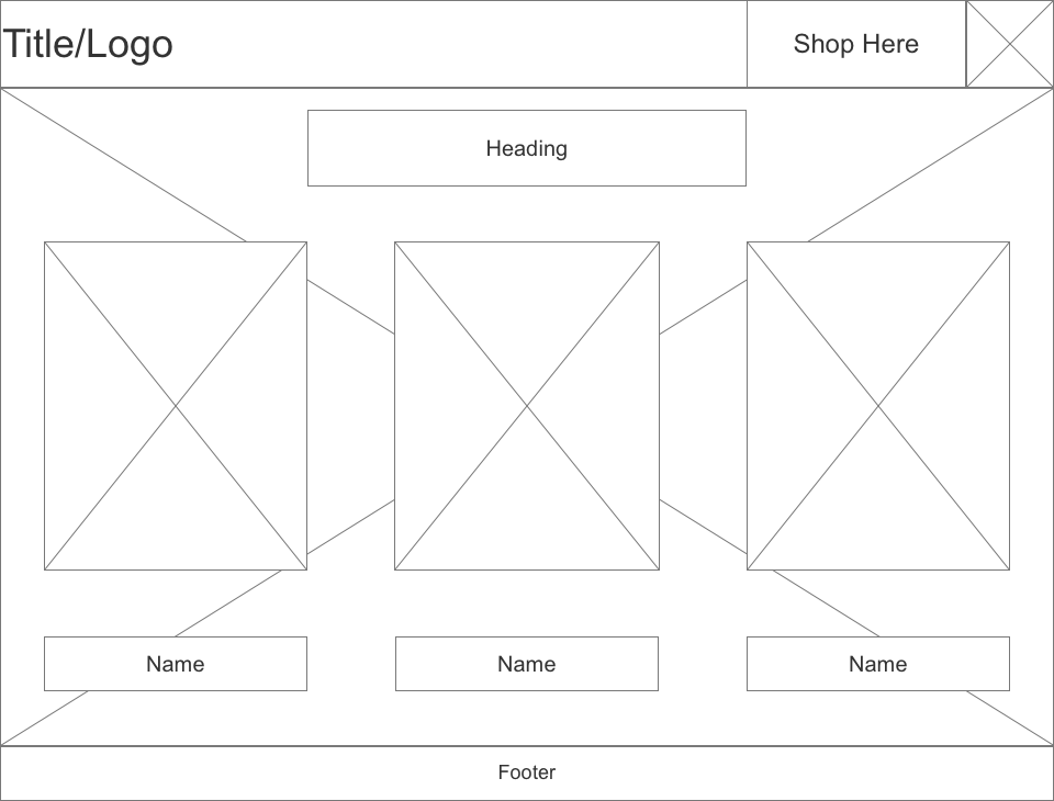
CLICK TO DOWNLOAD LO-FI WIREFRAMES
Hi-Fi Design Prototypes
After being provided a color palette for the website, I created four different design prototypes for a single page, using various combinations of the colors provided, as well as different fonts that I had chosen for the typography. I later met with the Team Lead and a portion of the team to discuss the merits of each of the prototypes and decide on a specific color scheme to use consistently throughout the website. These prototypes were used in simple user testing to determine differences in usability and user experience between designs.
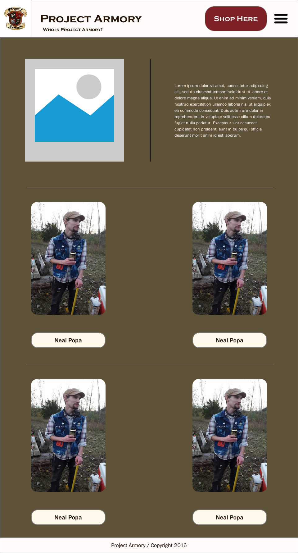
CLICK TO DOWNLOAD HI-FI DESIGN PROTOTYPES
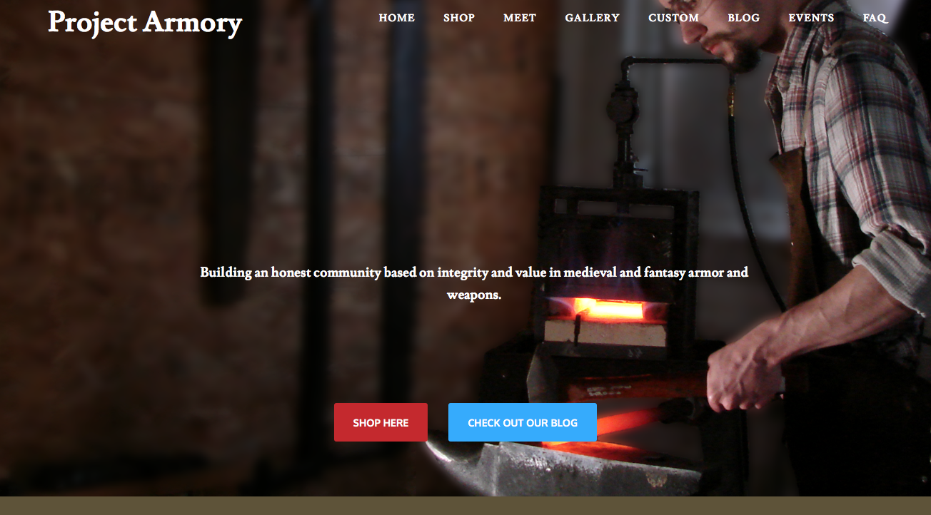
Email Landing Page
While the website goes through the development process, I created an email landing page that acts as a temporary home page. I used Instapage as a front-end content creator to design the page, and I deployed it using a Wordpress plugin. I also linked the email sign-up sheet to Project Armory's Mailchimp account; I discussed ideas for email campaigns with them as a way to create buzz and excitement around the impending website launch.
Coding and Development
I constructed the website using Wordpress and used the free version of Optimizer theme to gain a great deal of control over the layout and the style of the website. I also used Optimizer so that, as the company grew, they would have the capability of upgrading Optimizer to gain further control over customization without having to switch themes entirely. I still used some custom CSS to stylize some components of the website for the sake of consistency. I also used the Page Builder plugin to utilize a grid system as I created some of the pages, and I used an Image Caption Hover plugin alongside Page Builder to make the backbone for the Gallery page. Lastly, I installed WooCommerce so that Project Armory can begin the transition from selling products on Etsy to selling products on their website.
At this point, since the architecture of the website and the structure of the pages are in place, the Team Lead wanted to take over creating and placing content, using me in a support role, where I advise how content is used and how to best update the website. As such, the construction of the website is now being driven by the team at Project Armory, though I am still working in this support role.
A link to the website can be found below.
LAHR Usability Testing
LAHR Usability Testing
Overview
The Lansing Association for Human Rights (LAHR) wanted me to conduct some preliminary usability testing and auditing of their website. This was done for the purpose of assessing the current state of the website, as well as what to emphasize in the case of a redesign or update.
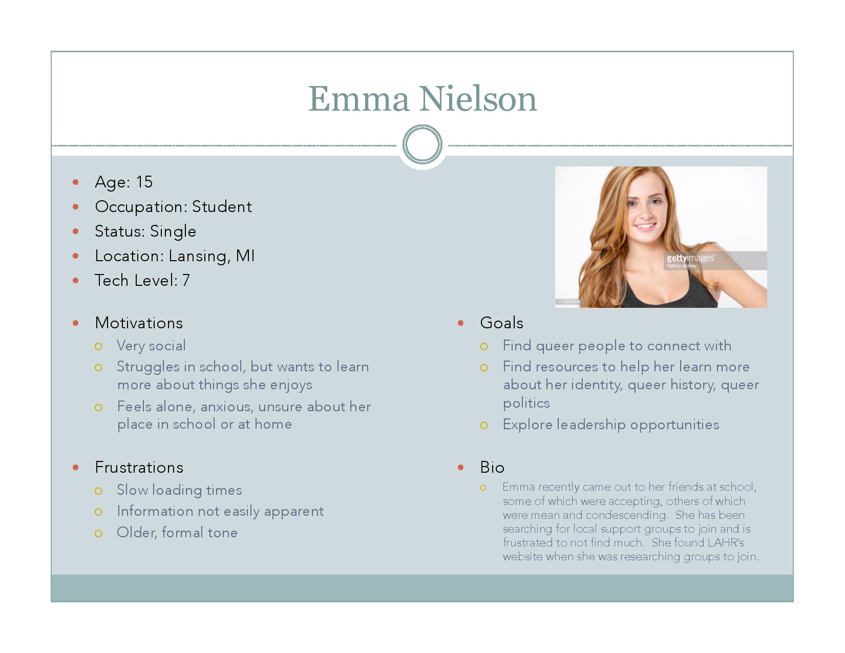
Research and Personas
First, I identified the various user groups that the LAHR website aims to attract and created personas to better realize the individuals in those groups. As I created the personas, I researched how the users in those groups operated and brainstormed potential motivations, goals, and frustrations they might have. These personas helped me identify what the potential uses for the website would be, as well as what how the various testers would want from the website. The personas can be found below.
Website Core Functions
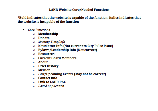
With these user groups and their motivations in mind, I next brainstormed the various functions that the website should be capable of in order to both service the user groups and the needs of LAHR. I recorded those functions and then tested the website to see what functions it is actually capable of. This was done to figure out what functions I should emphasize in the usability testing. This way, I can pinpoint the most pressing usability issues on the website. The list of core functions can be found below.
CLICK TO DOWNLOAD FUNCTION LIST
Cursory Expert Evaluation/Audit
I next worked through an evaluation of the website's pages, testing exactly how capable the website is of performing its key functions and finding major usability issues in the process. I went through every page and tested every link and video to see what works correctly and what is not functioning properly. I also looked through the informative content to see what is outdated, what is incorrect, and what serves its purpose correctly. Lastly, I analyzed my findings for major usability issues, making a list of most pressing issues to consider. The evaluation/audit can be found below.
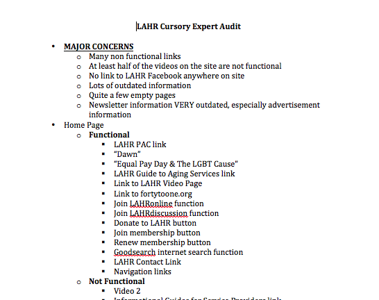
CLICK TO DOWNLOAD EVALUATION/AUDIT
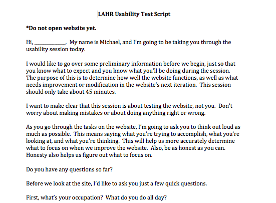
Usability Script/Tasks
Using the information I gathered from my audit and from my list of functions, I created a script to use for usability test sessions and a list of tasks for testers to perform. The script was adapted from Krug's script in "Rocket Surgery Made Easy", with questions modified to match the broad scope that the LAHR usability testing had. The tasks were created by looking at the list of functions available on the website and the list of functions that were most pressing to test. Once I had these documents complete, I found 3 testers that met the criteria set for me in the personas and conducted the testing. The script and set of tasks can be found below.
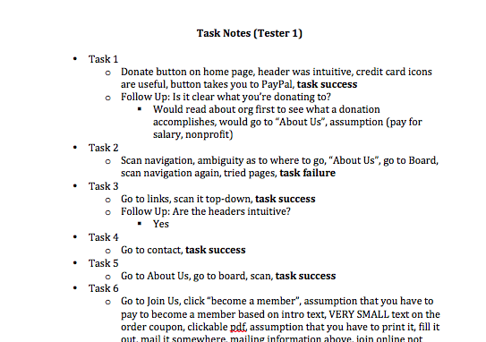
Usability Testing
I conducted the usability test on 3 participants, working through the script and the task list, taking notes on the processes that were used and the rationale behind those processes. I asked follow-up questions when necessary to further analyze why a certain task was frustrating, easy, or confusing. The test notes for one test session can be found below.
Findings
Using all of the information that I compiled, I created a short list of usability issues to emphasize, along with components of the website that were particularly usable. This was prepared as a short memo to ensure that it is as easy to navigate as possible. I presented this to LAHR and discussed the rationale behind the points on the memo. The findings document can be found below.